Frontend April 5
This is why we needed Vue3 (which is now merged into develop btw)
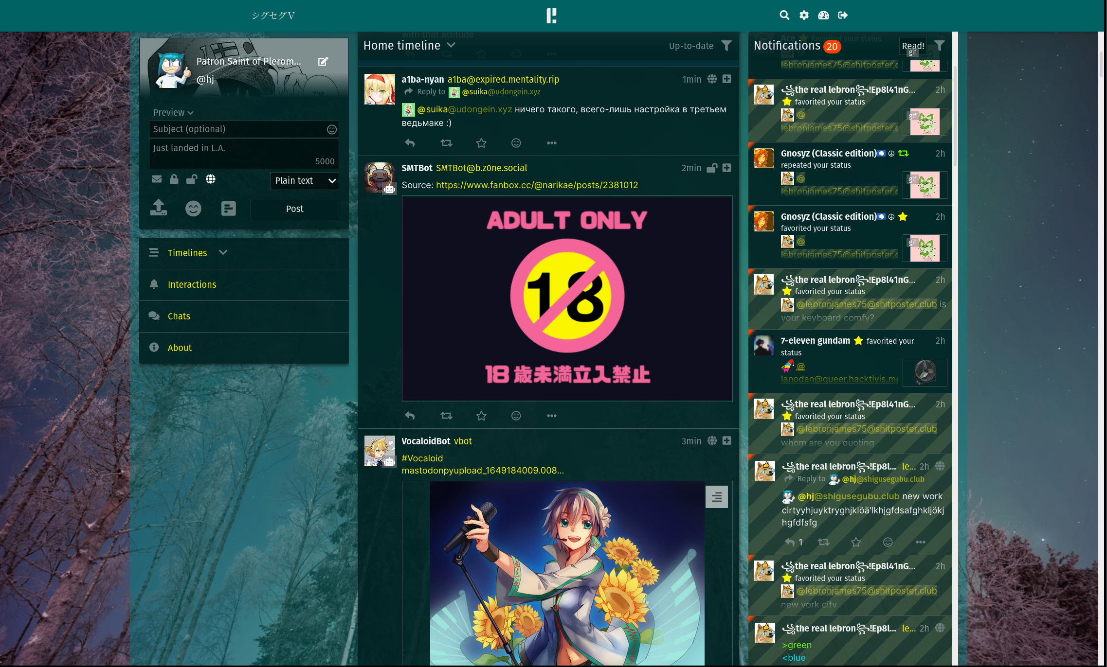
There is now single "Notifications" component on the entire page and it's being teleported around depending on layout, therefore your drafts in it are no longer lost when you accidentally resize your browser. The entire layout also been massively refactored, it uses CSS Grid instead of Flex as well utilizes position: sticky not only for sticky headers but also for keeping entire sidebar column in place, previously it had some ugly hacks for it.
You can still scroll the "main" column by scrolling anywhere, except navbar, this is a bit of a compromise as now the container is scrollable, not body, partially because scrollbar inside of it looks better than on body, partially because position: sticky does not work on elements inside body for some reason.
Currently sidebars are always hidden (in webkit-cringed browsers only) but I'll be working on options to keep them visible even on sidebar.
Also chats use same layout as the rest of the UI no more "chat mode" or whatever it was called. Only problem is that header can jump around a bit until it sticks.
My only fear is palemoon users.
Oh and btw how it currently looks on firefox:

As I said, scrollbars are WIP, now i also see there's some shadows issues, maybe will do something about too.
